Bio
Hannah is a multidisciplinary Brand Designer and Art Director working at the intersection of strategy, design, and real-world execution. Informed by psychology, archival references, and contemporary digital culture, her work explores how brand is built, experienced, and evolves across touchpoints. She most recently led creative at Altered State NYC and founded Ofelia Creative Studio, an independent practice focused on thoughtful, culturally grounded brand experiences.
Experience
Altered State
Sr. Art Director
2023 - 2026
Ofelia Creative Studio
Creative Director/Founder
2020 - Present
Selected Fractional Partnerships
Not That Sweet
Creative Director & Brand Designer
2025–Present
Anej Skin Studio
Creative Director & Brand Designer
2023
Sakuranna
Art Director & Brand Designer
2021
Uncompromised Creative
Studio Intern
2018-2020
Experience
Brand Identity Systems
Art Direction
Campaign Concepting
Type Design
Layout & Print
Web Design
Digital & Social Campaigns
Experiential Design
Art Direction
Campaign Concepting
Type Design
Layout & Print
Web Design
Digital & Social Campaigns
Experiential Design
Connect
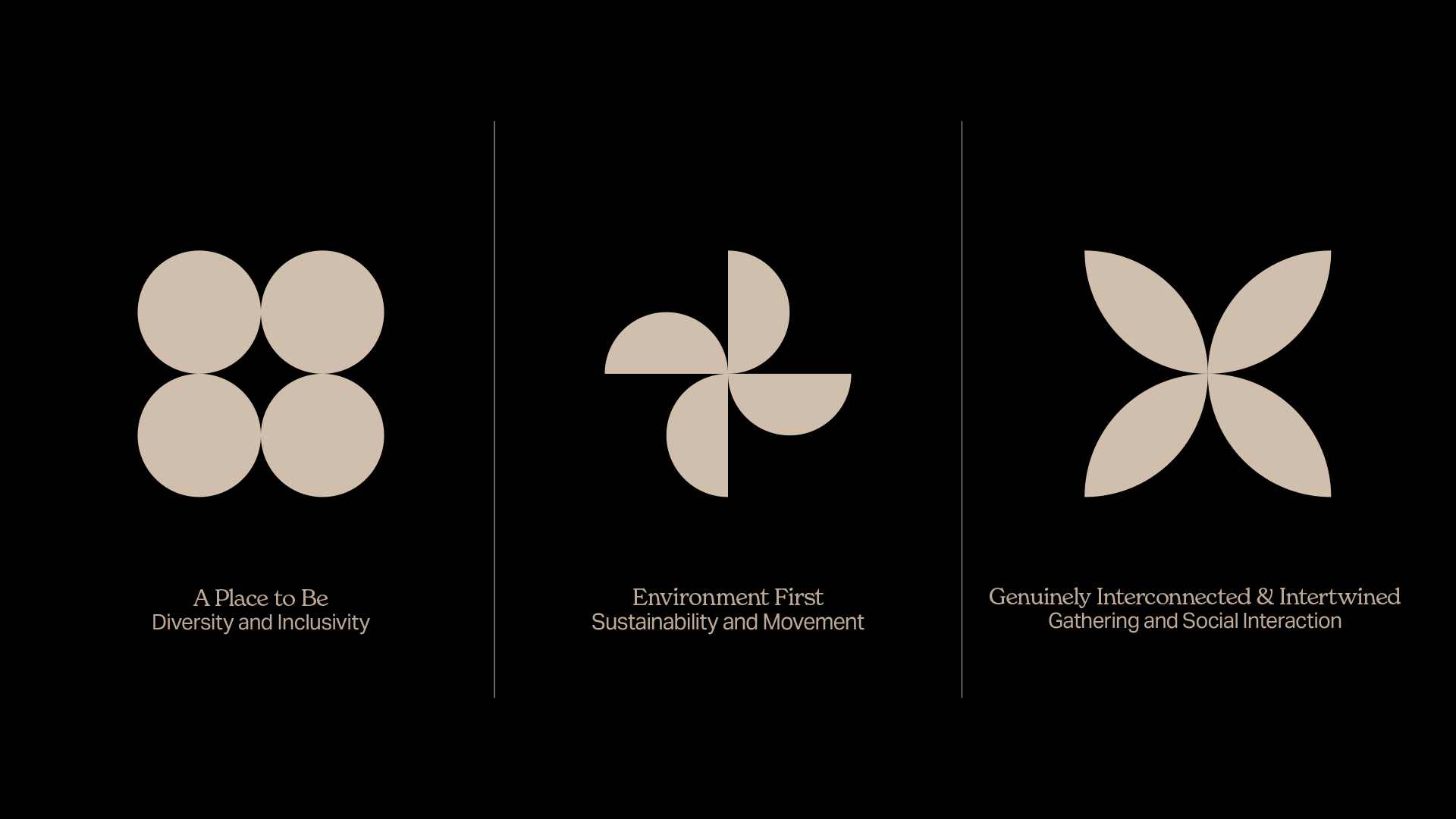
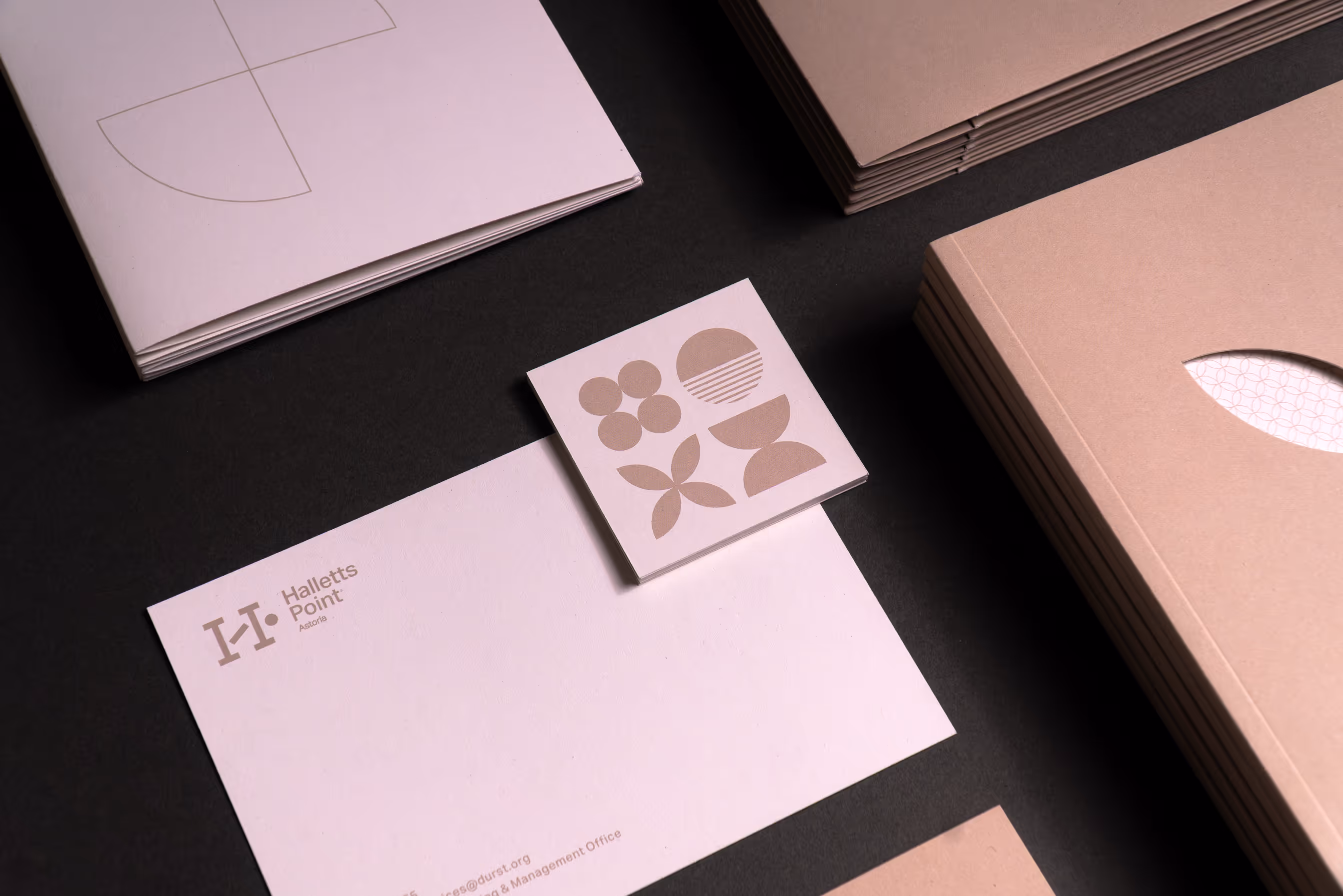
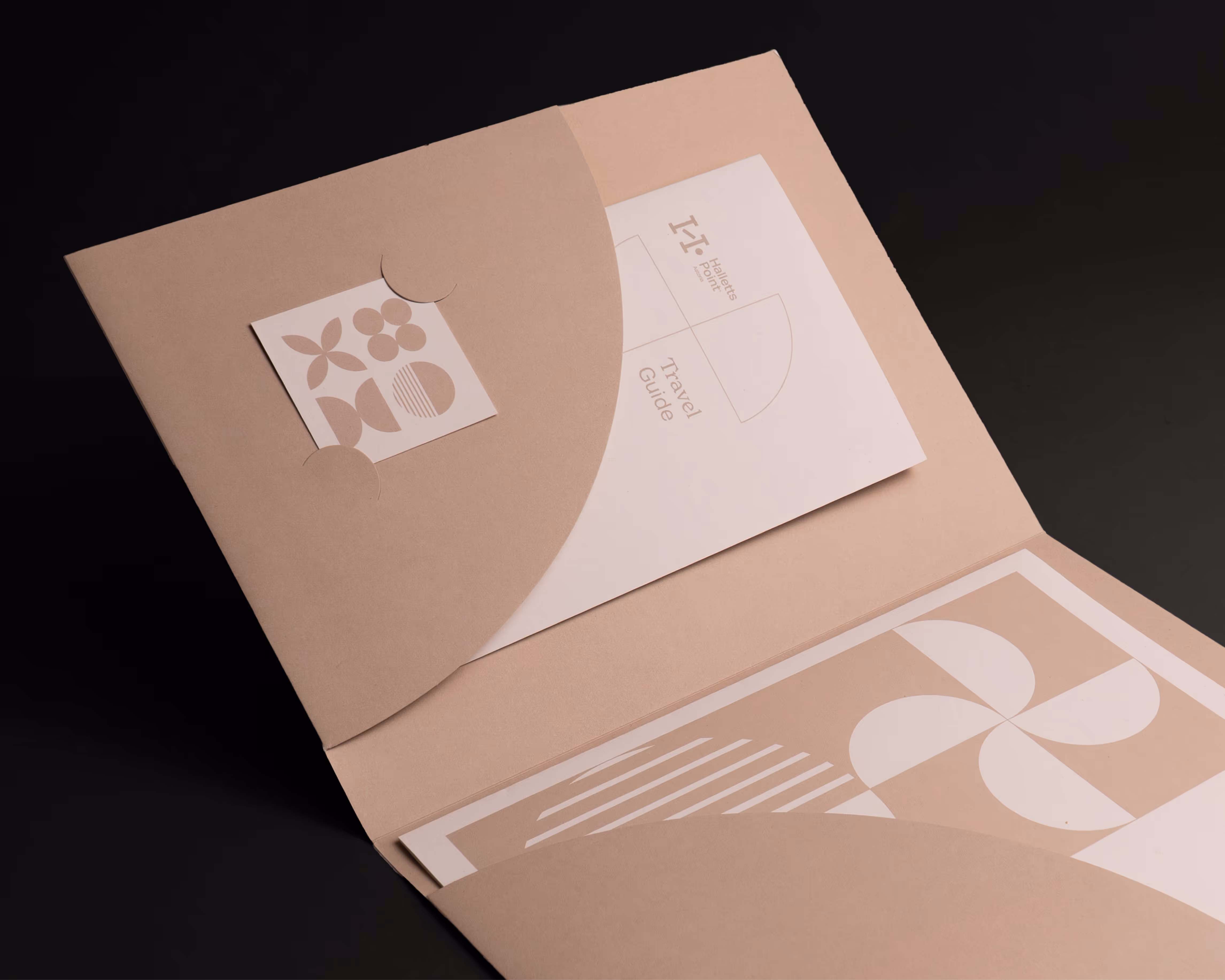
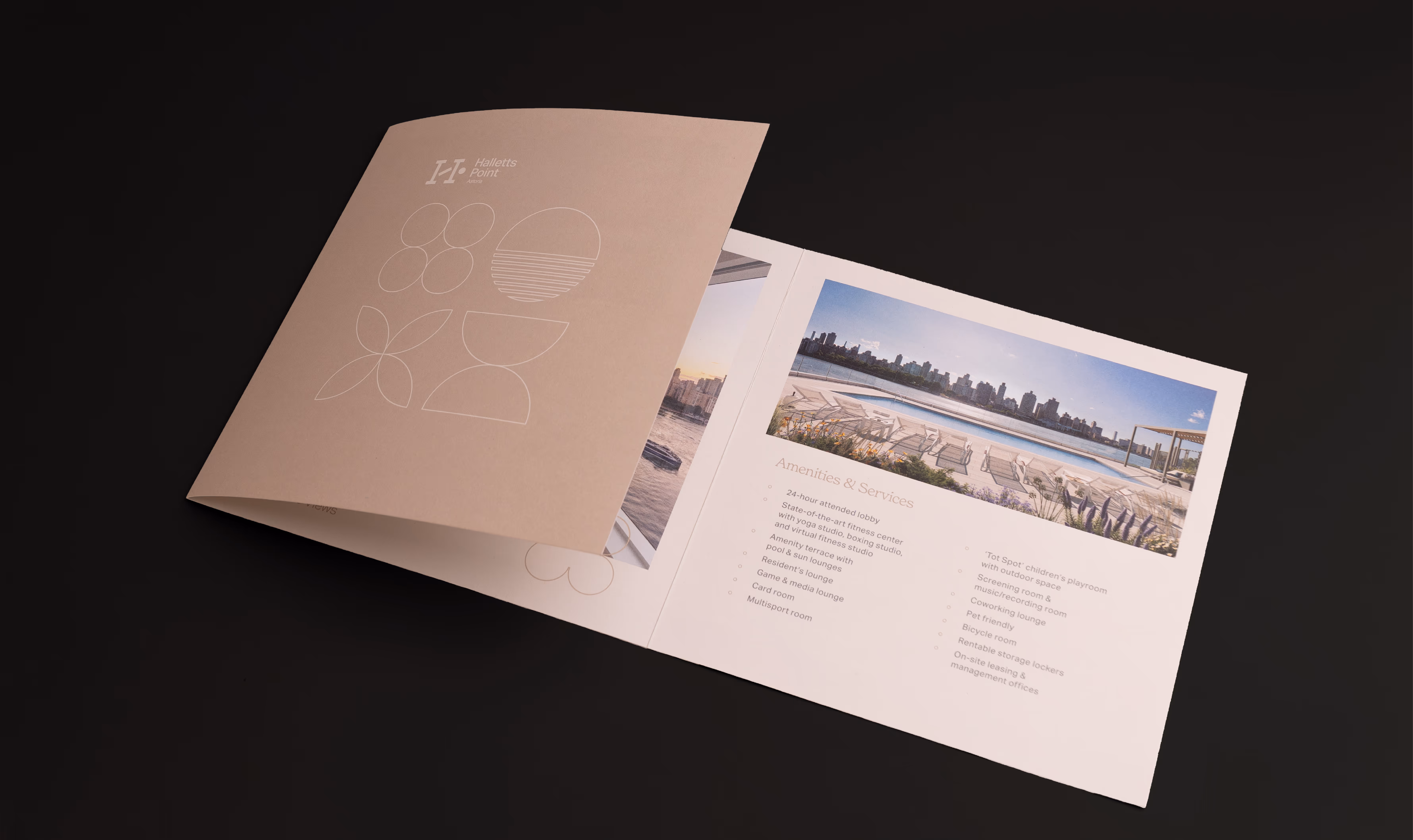
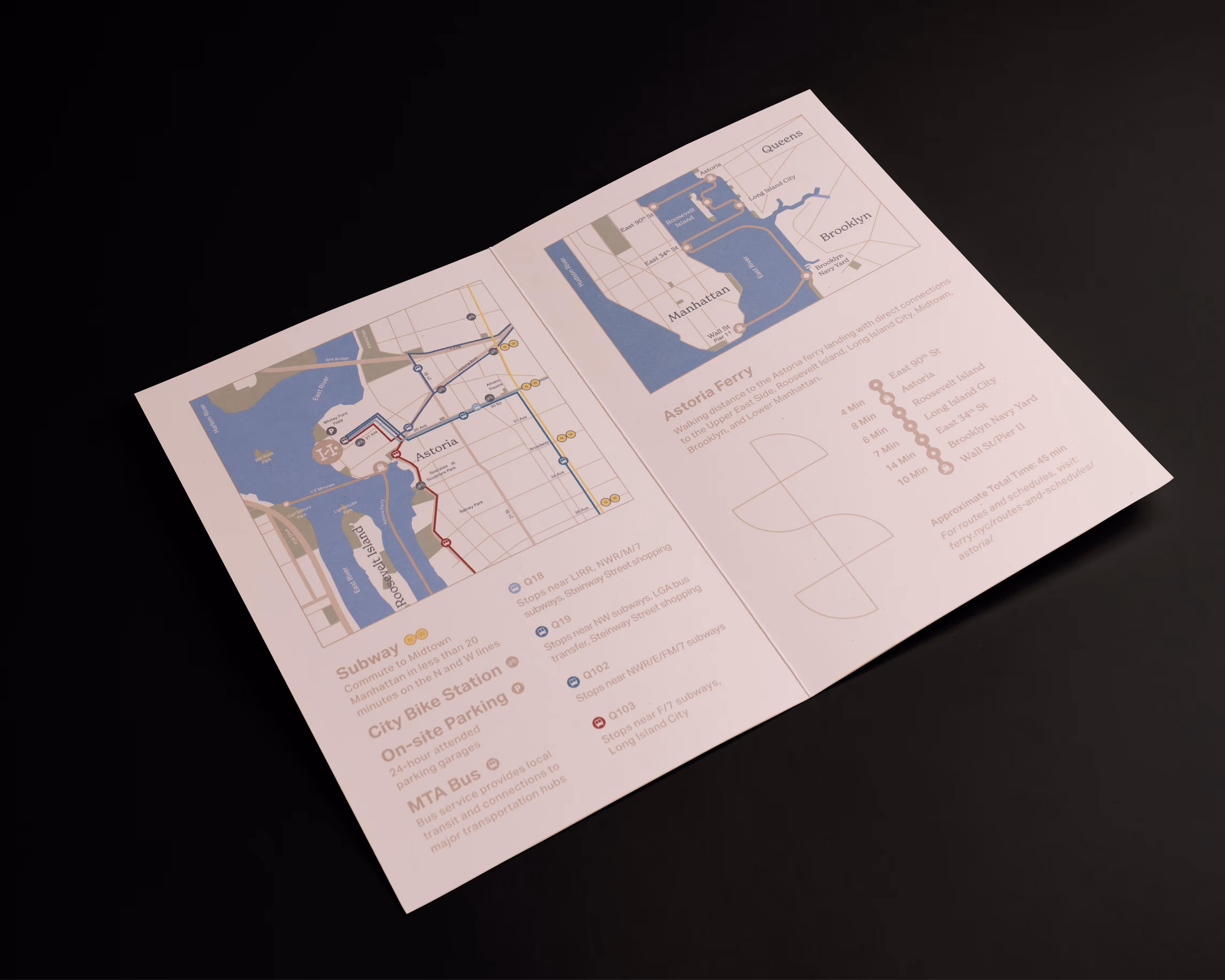
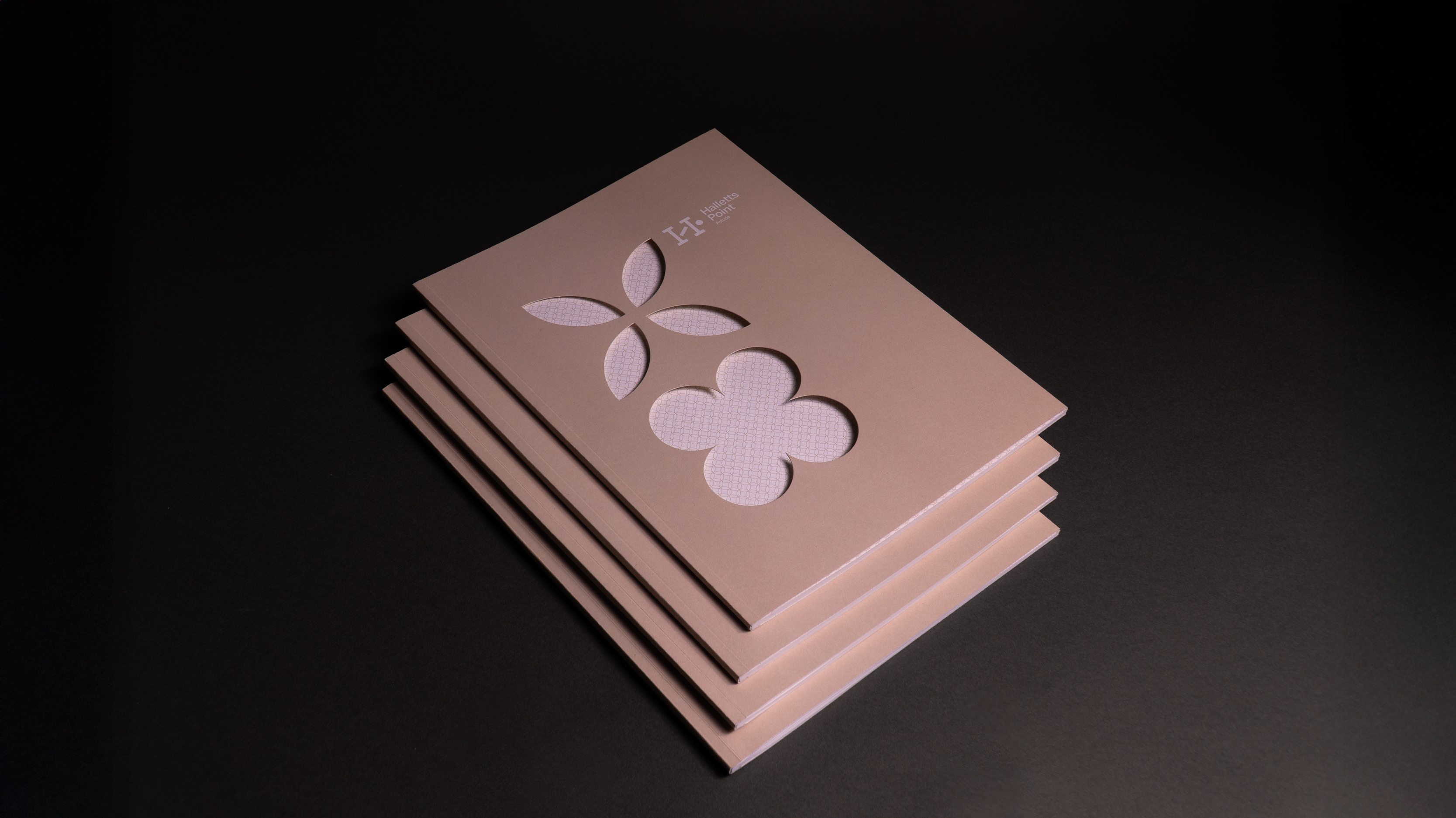
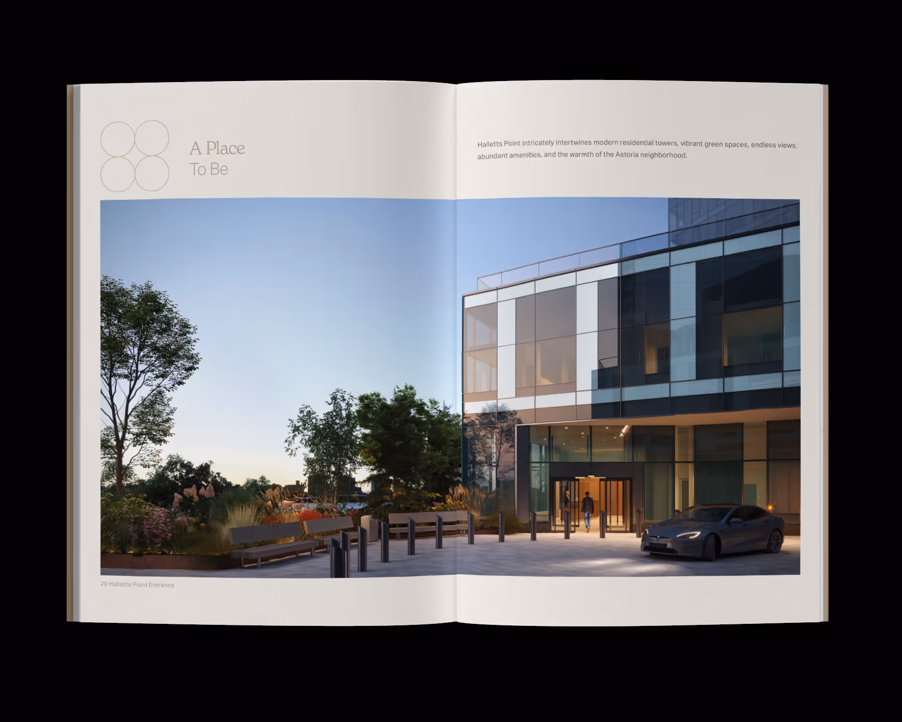
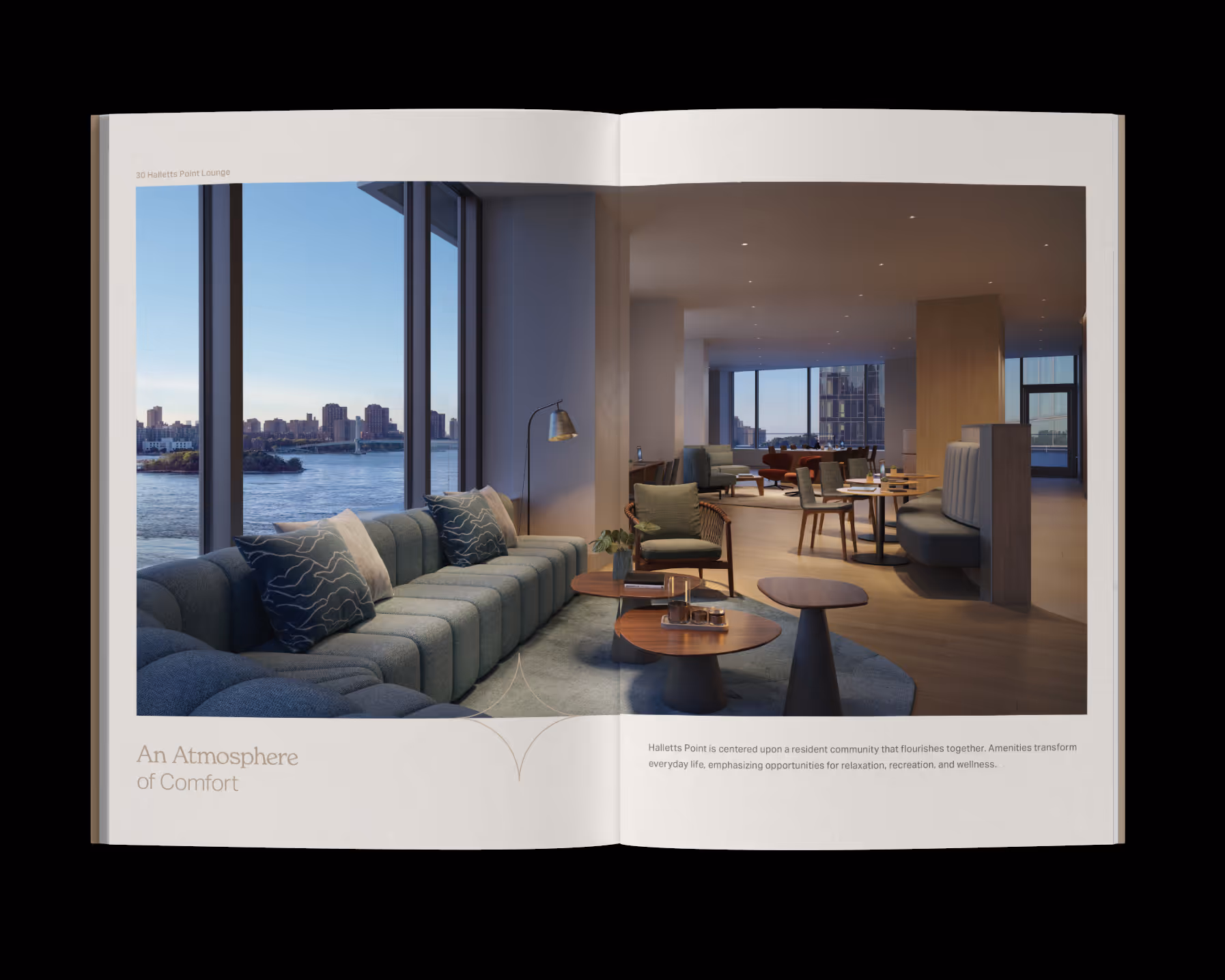
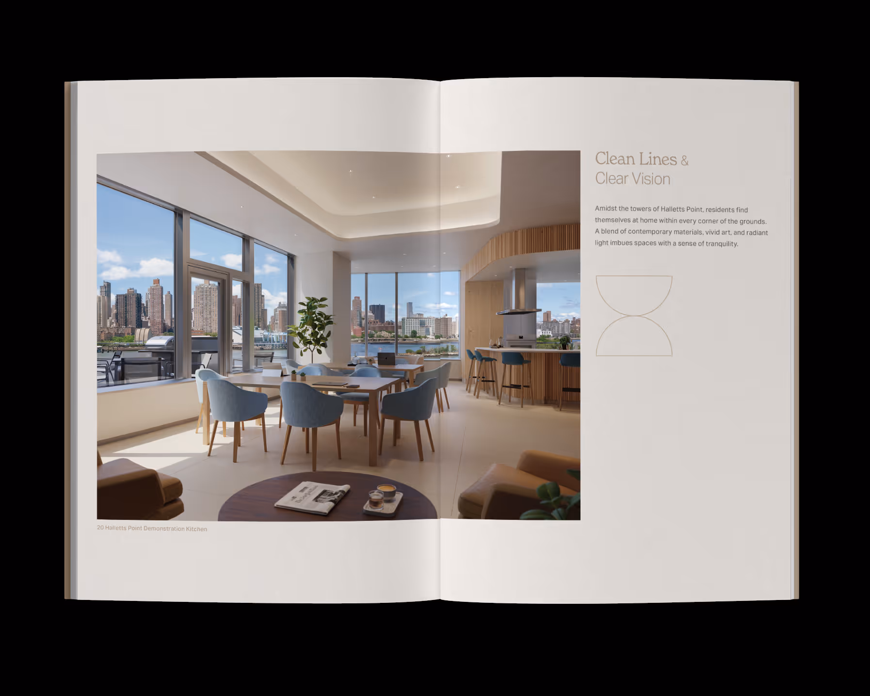
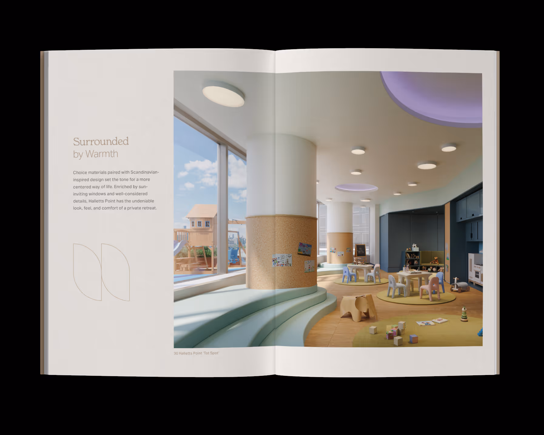
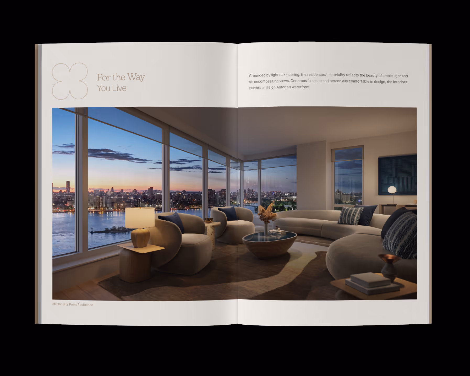
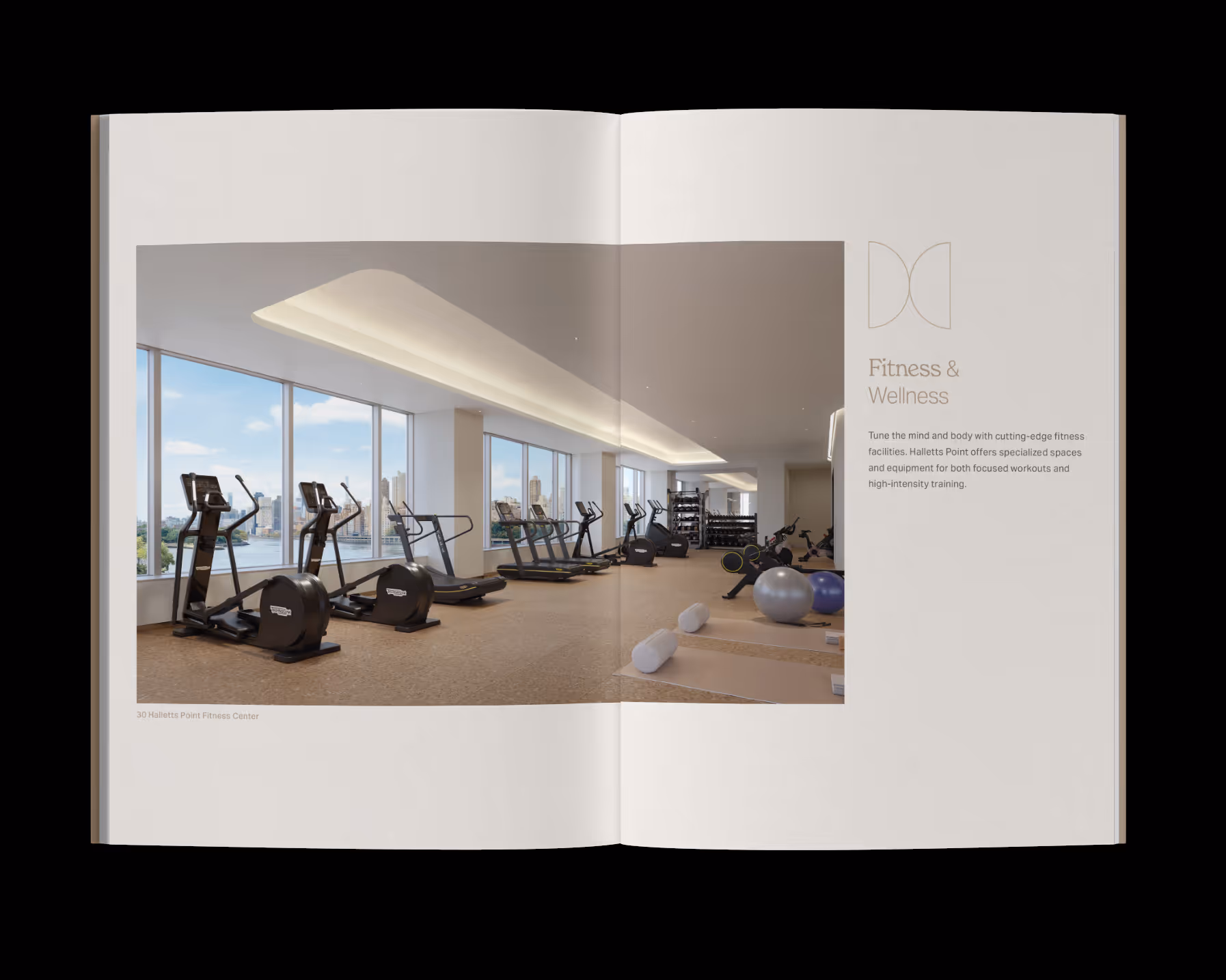
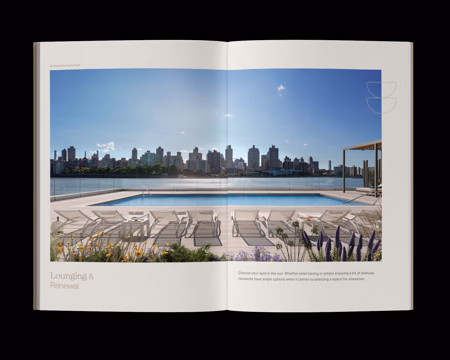
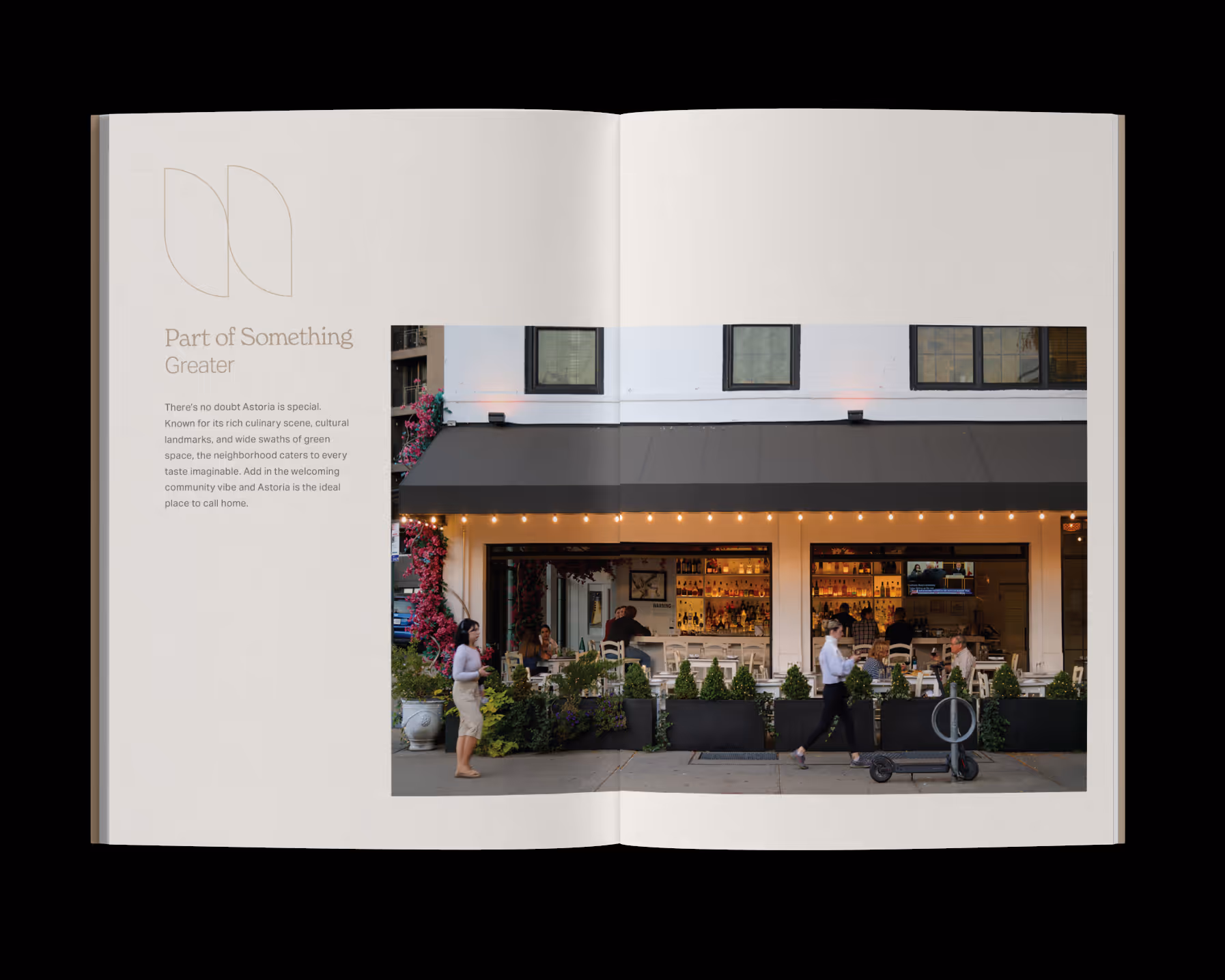
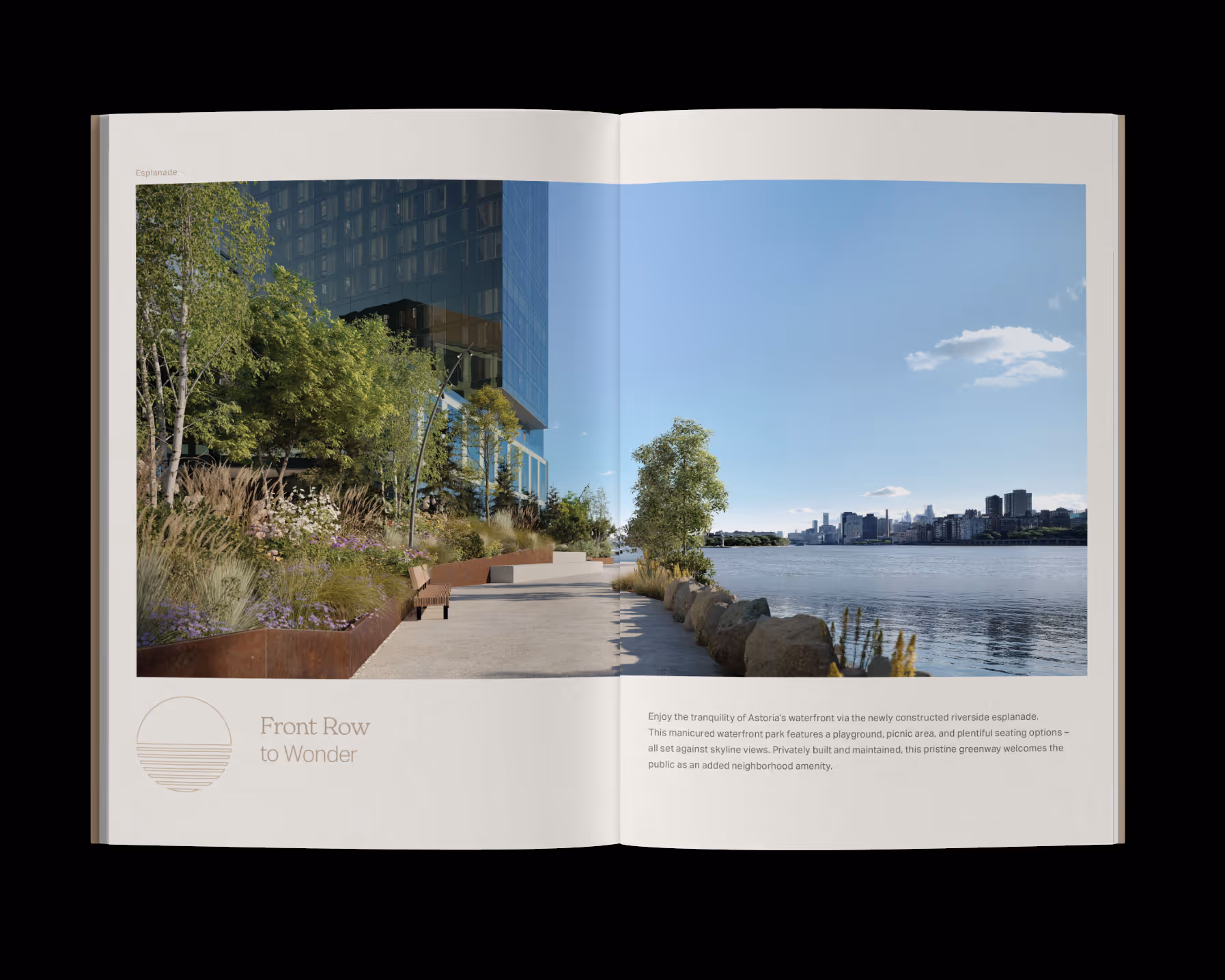

Halletts Point
Lead Brand Designer • Creative Direction
Halletts Point is a multi-phase waterfront residential development in Astoria, requiring a brand that could evolve alongside the neighborhood while supporting immediate leasing efforts. I led the creative direction and developed a flexible identity system spanning digital, print, environmental graphics, sales collateral, advertising, and photography direction. Rather than creating one-off marketing pieces, I focused on building a scalable visual language that could be applied consistently across every resident and leasing touchpoint. The result was a cohesive brand system designed to support both launch campaigns and the continued growth of the development.
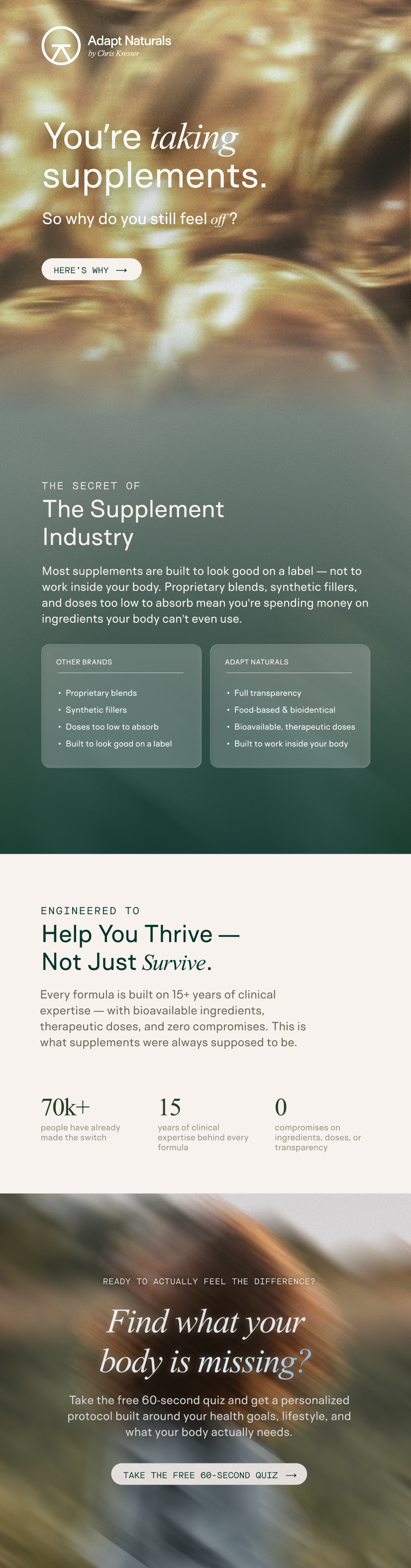

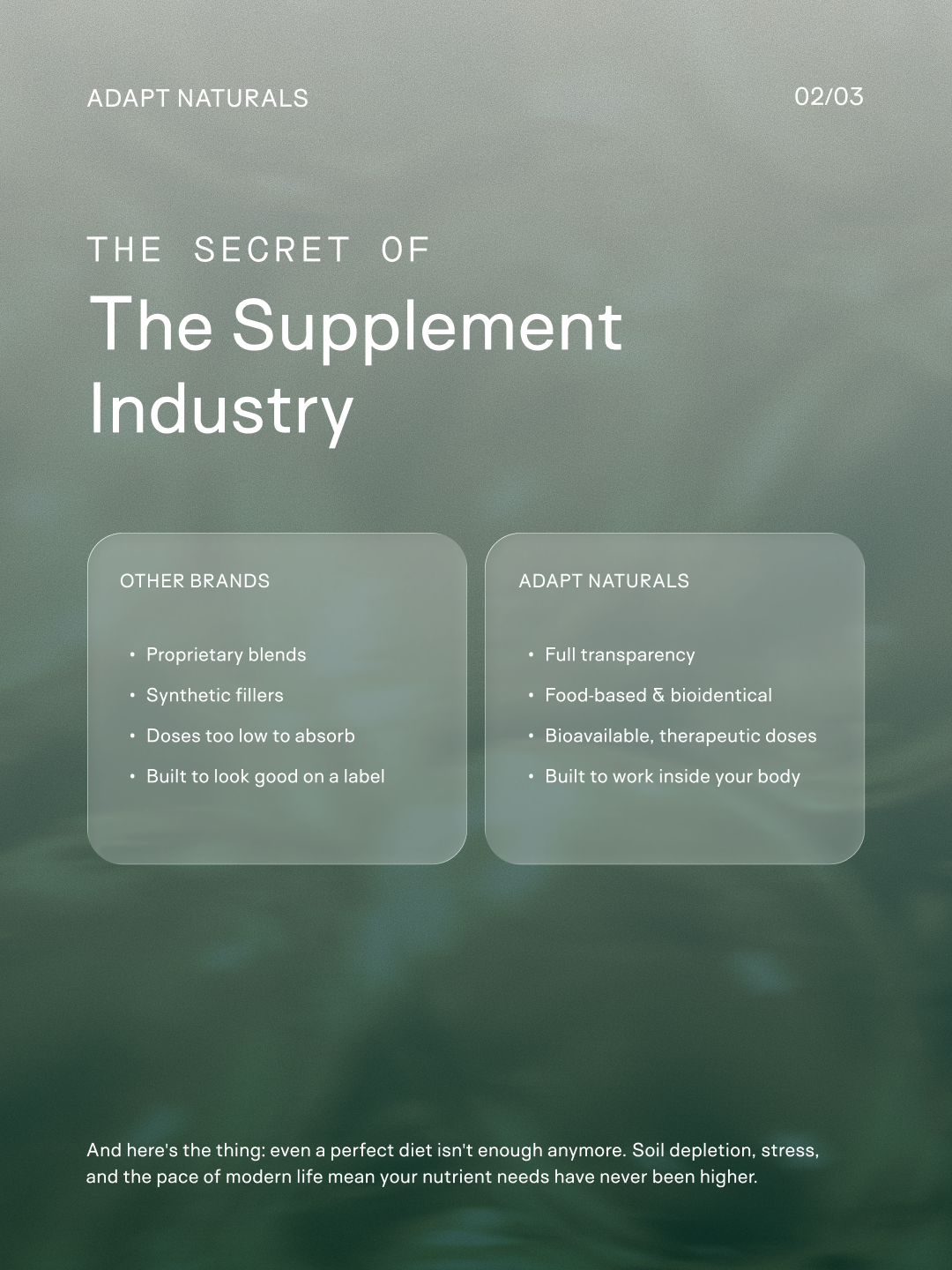
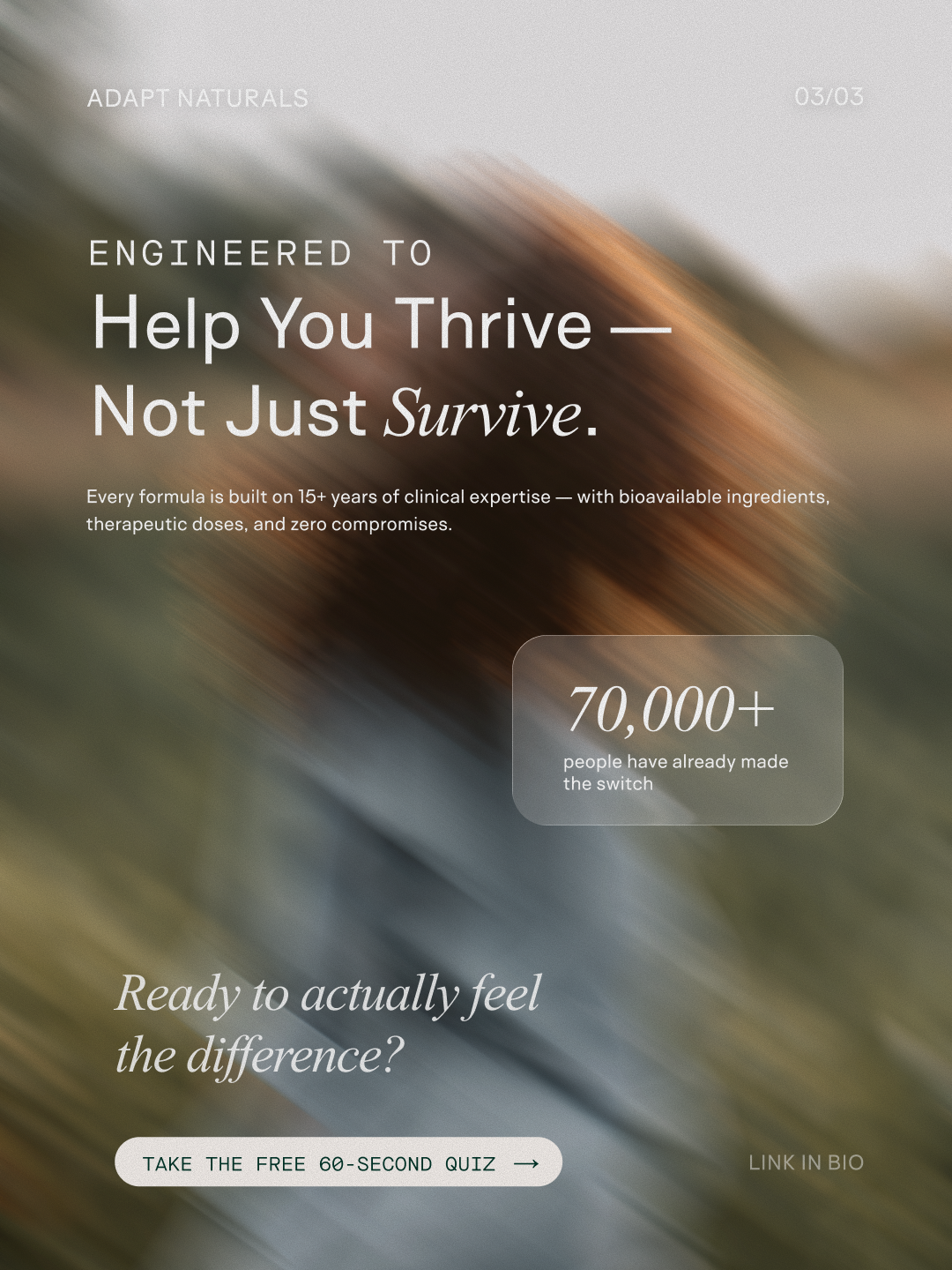
Adapt Naturals
Creative Direction • Integrated Campaign
I created this self-initiated project to explore how educational content for a science-led supplement brand could feel more premium, engaging, and easier to navigate. The concept reimagines Instagram as a storytelling channel by improving visual hierarchy, pacing, and information architecture while maintaining the brand's credibility. The work demonstrates my approach to translating complex health information into accessible content that encourages users to continue learning rather than feeling overwhelmed.
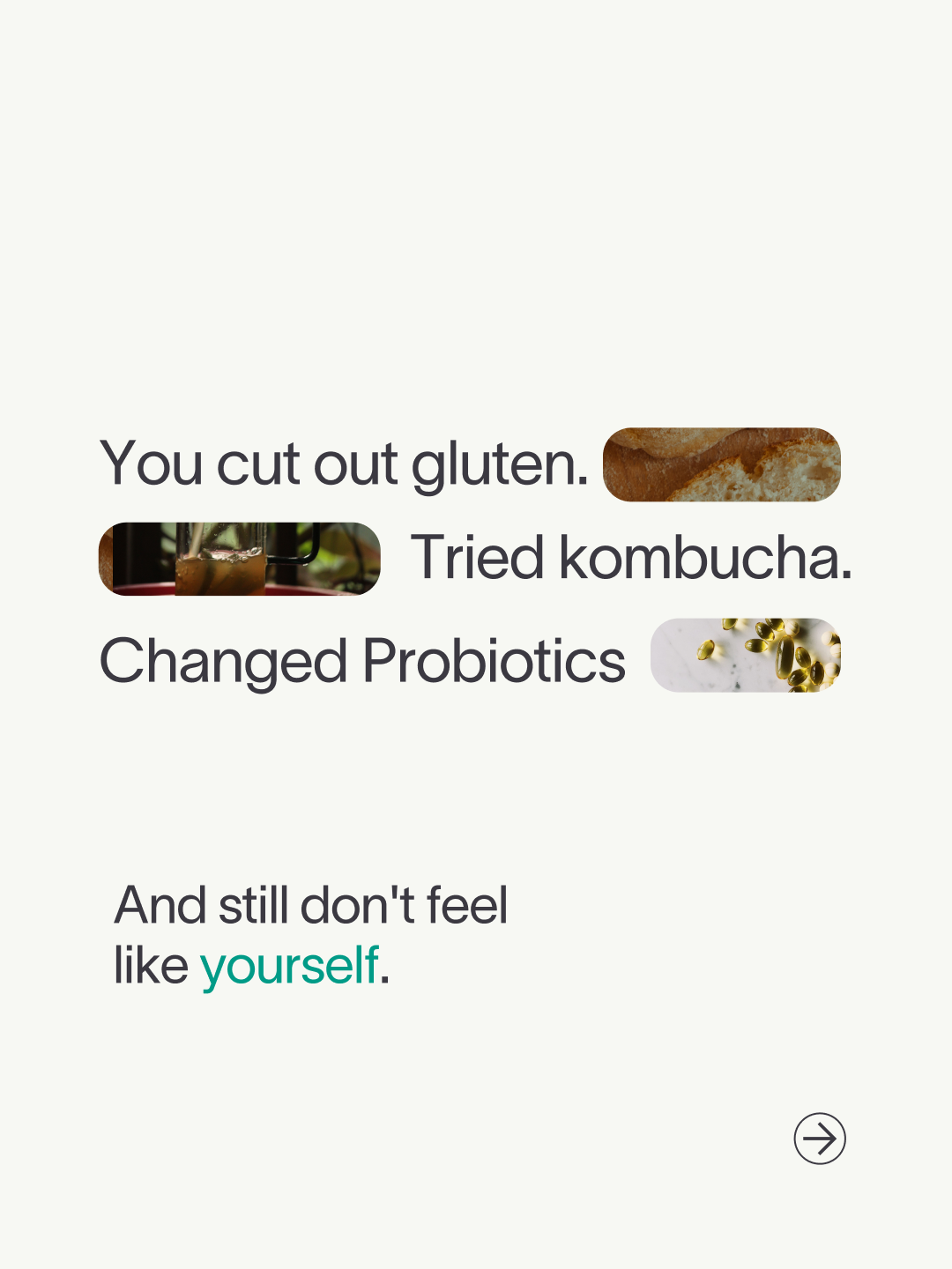
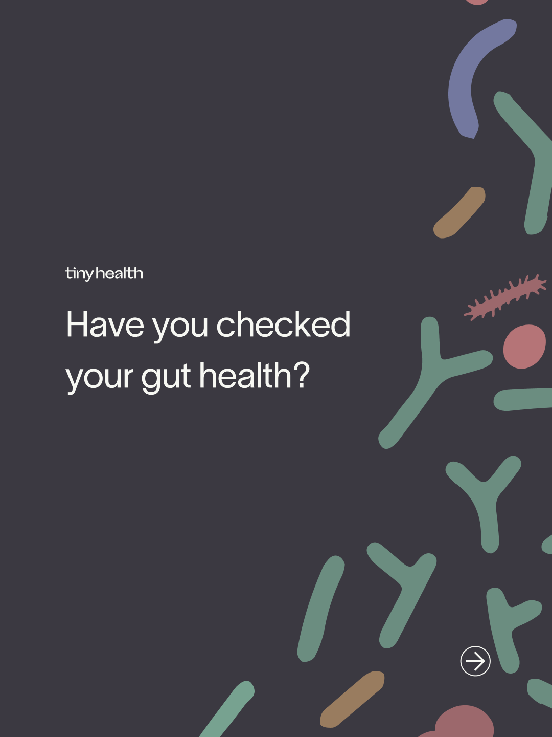
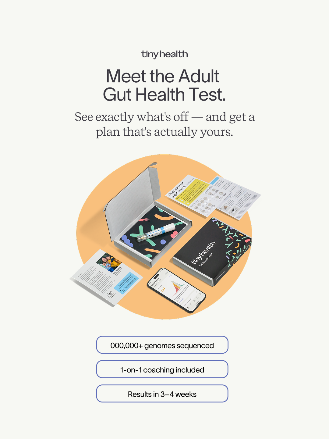
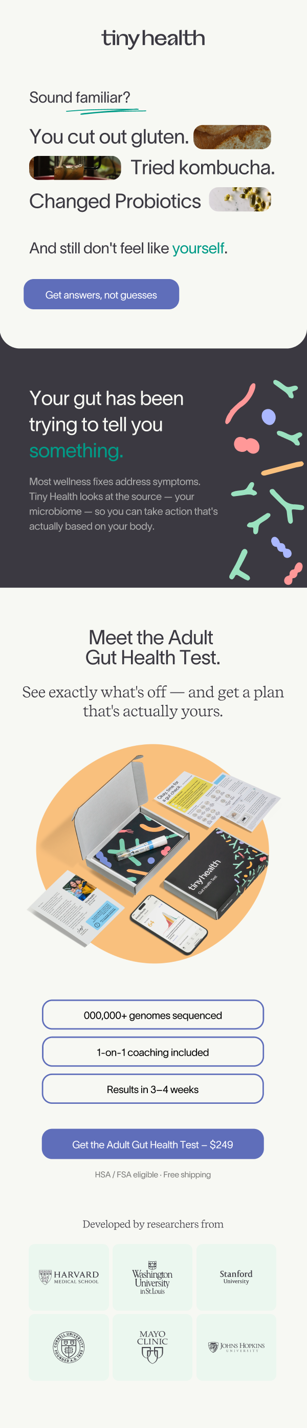
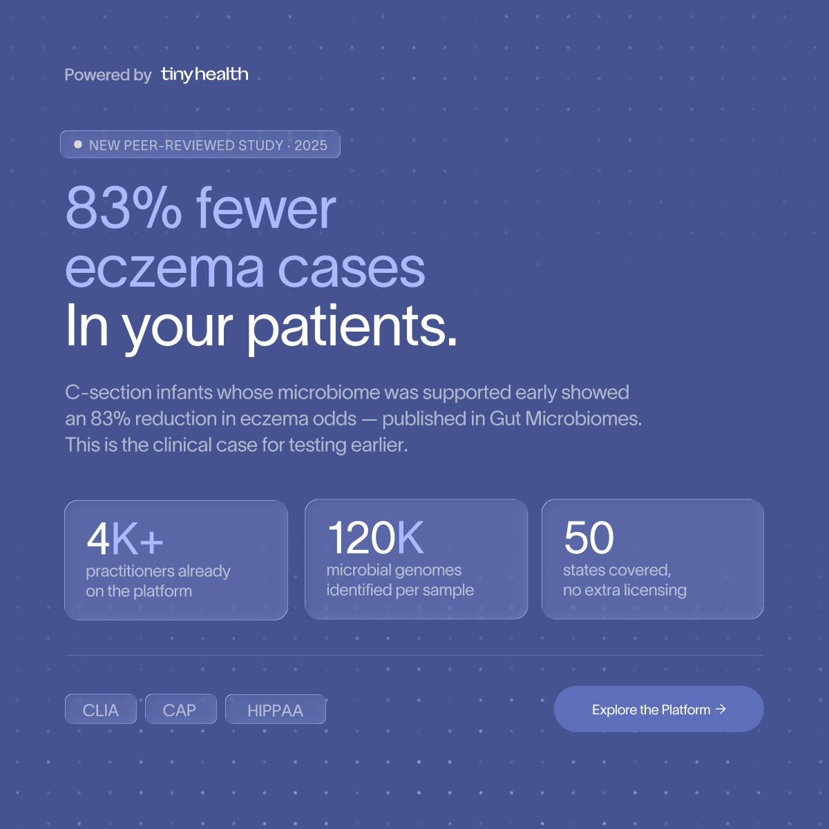
Tiny Health
Creative Direction • Social Campaign
For this concept, I explored how motion, typography, and sequential storytelling could simplify a complex health topic for social media. The objective was to create educational content that feels approachable without sacrificing scientific credibility. Every frame was designed to build curiosity, reinforce key messages, and guide viewers naturally through the narrative. The project reflects my interest in designing marketing that educates first while strengthening trust in the brand.
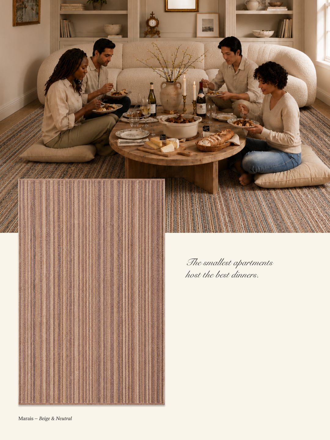
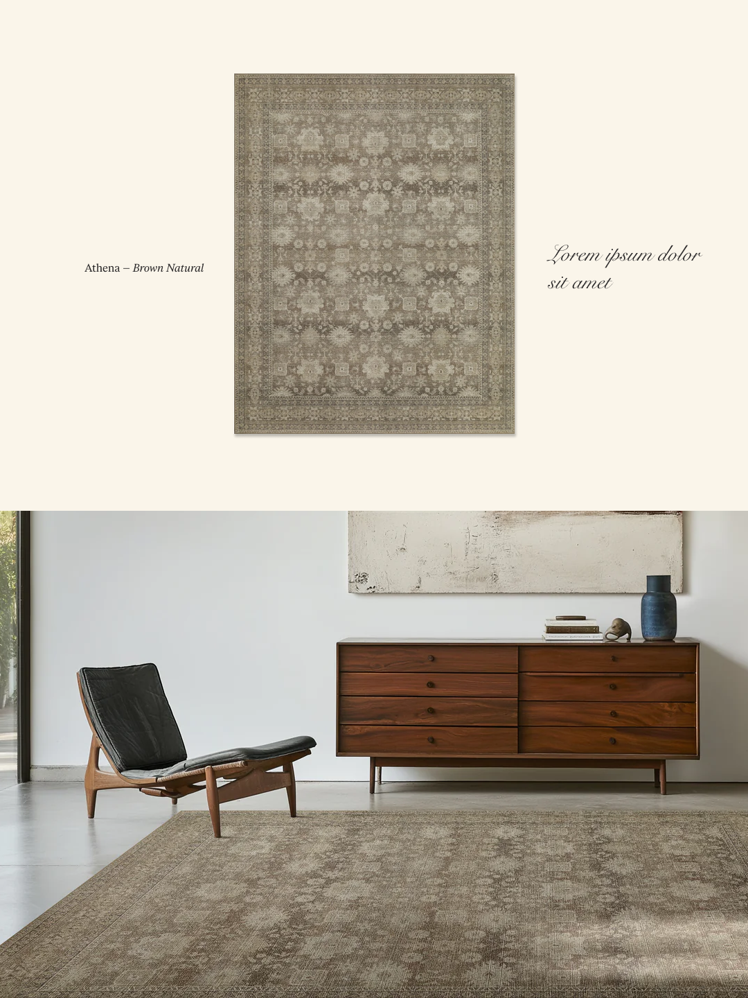
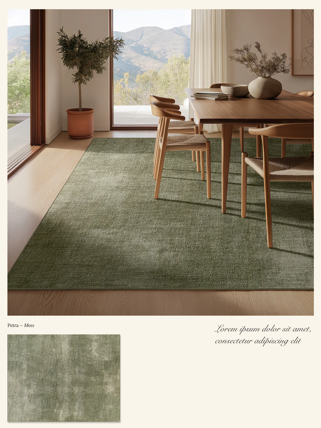
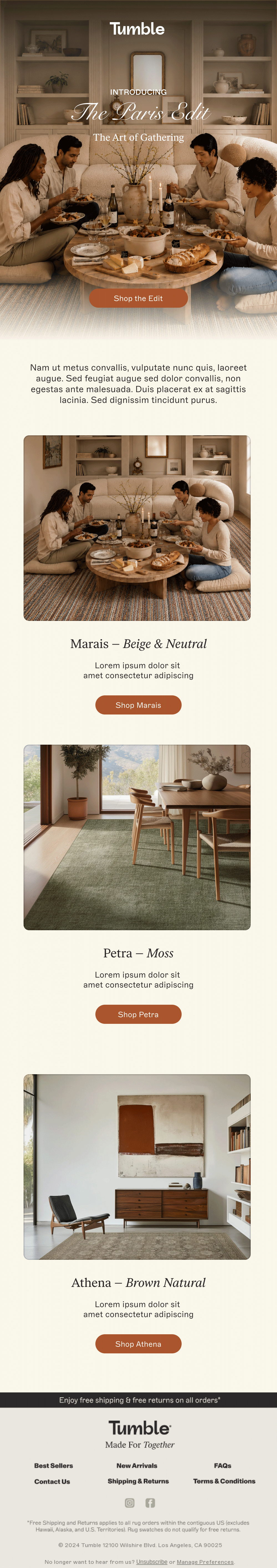
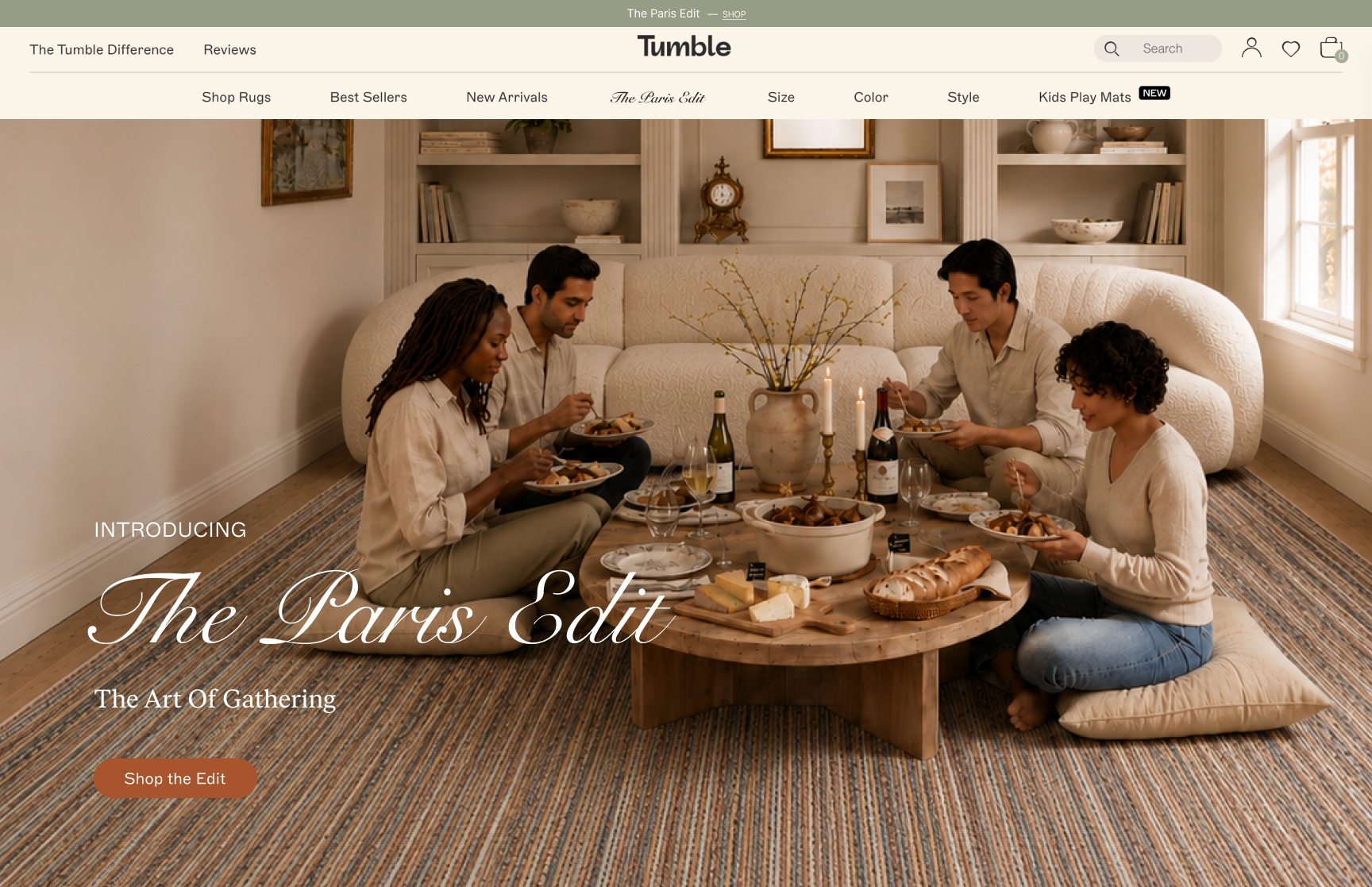
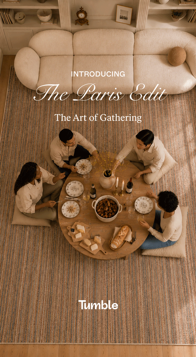
Tumble
Creative Direction • Integrated Campaign
This campaign reimagines Tumble through the lens of modern hospitality. Drawing inspiration from Parisian apartment culture, I created a campaign built around the ritual of gathering—friends sharing cuisine, conversation, and slow evenings in thoughtfully curated spaces. Rather than centering the product, the creative positions Tumble as an enabler of beautiful everyday experiences, appealing to a design-conscious audience with elevated taste and strong cultural curiosity. The concept was designed as a scalable campaign system that could extend across social, email, paid media, and brand storytelling.
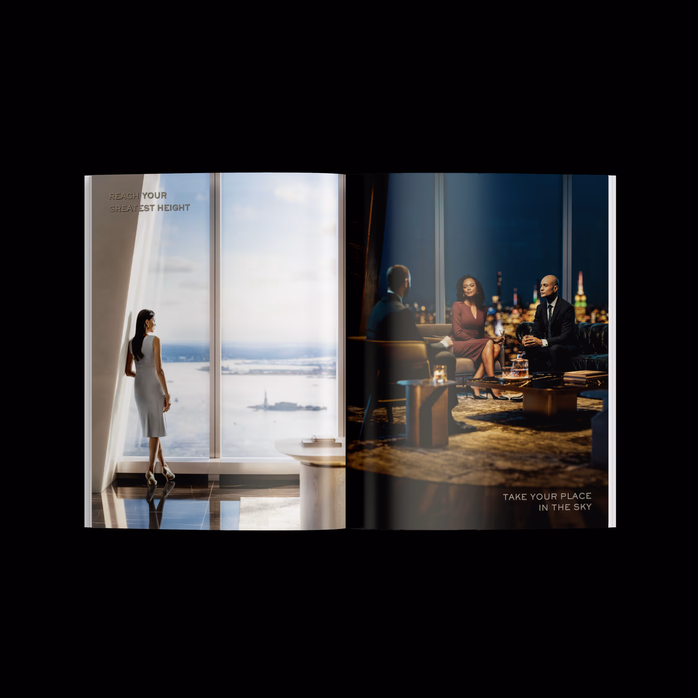
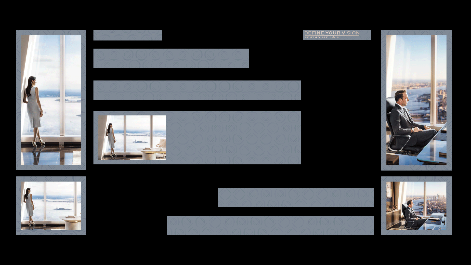
One World Trade Center
Integrated Campaign • Art Direction
For the launch of the One World Trade Center Penthouses, I led the art direction for campaign imagery supporting one of New York City's most iconic luxury residences. Working closely with photographers, stylists, casting, CGI artists, and internal stakeholders, I helped shape a visual narrative that reflected the sophistication of the property while supporting sales and marketing initiatives. The final creative extended across digital advertising, print, and promotional materials, ensuring a consistent premium experience across every customer touchpoint.
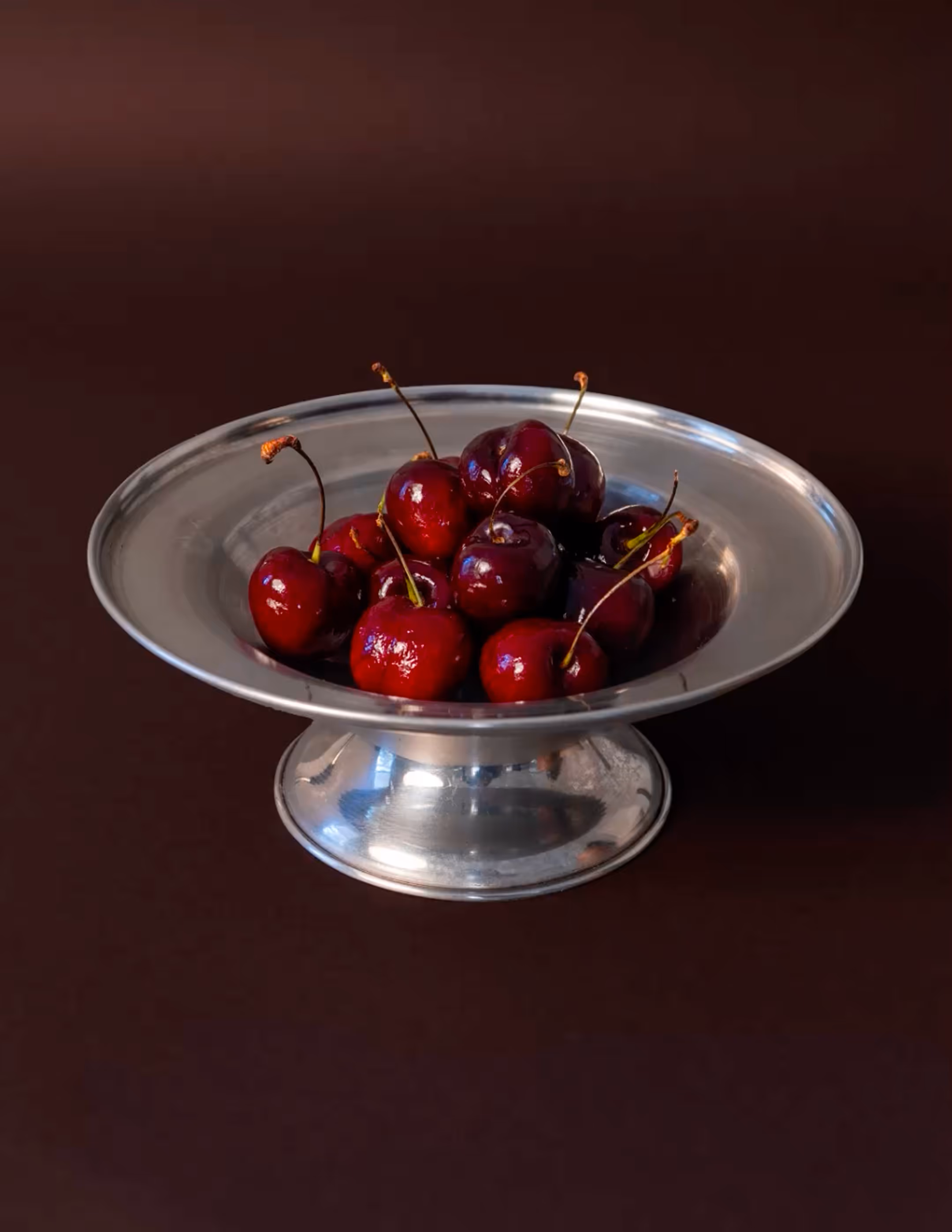
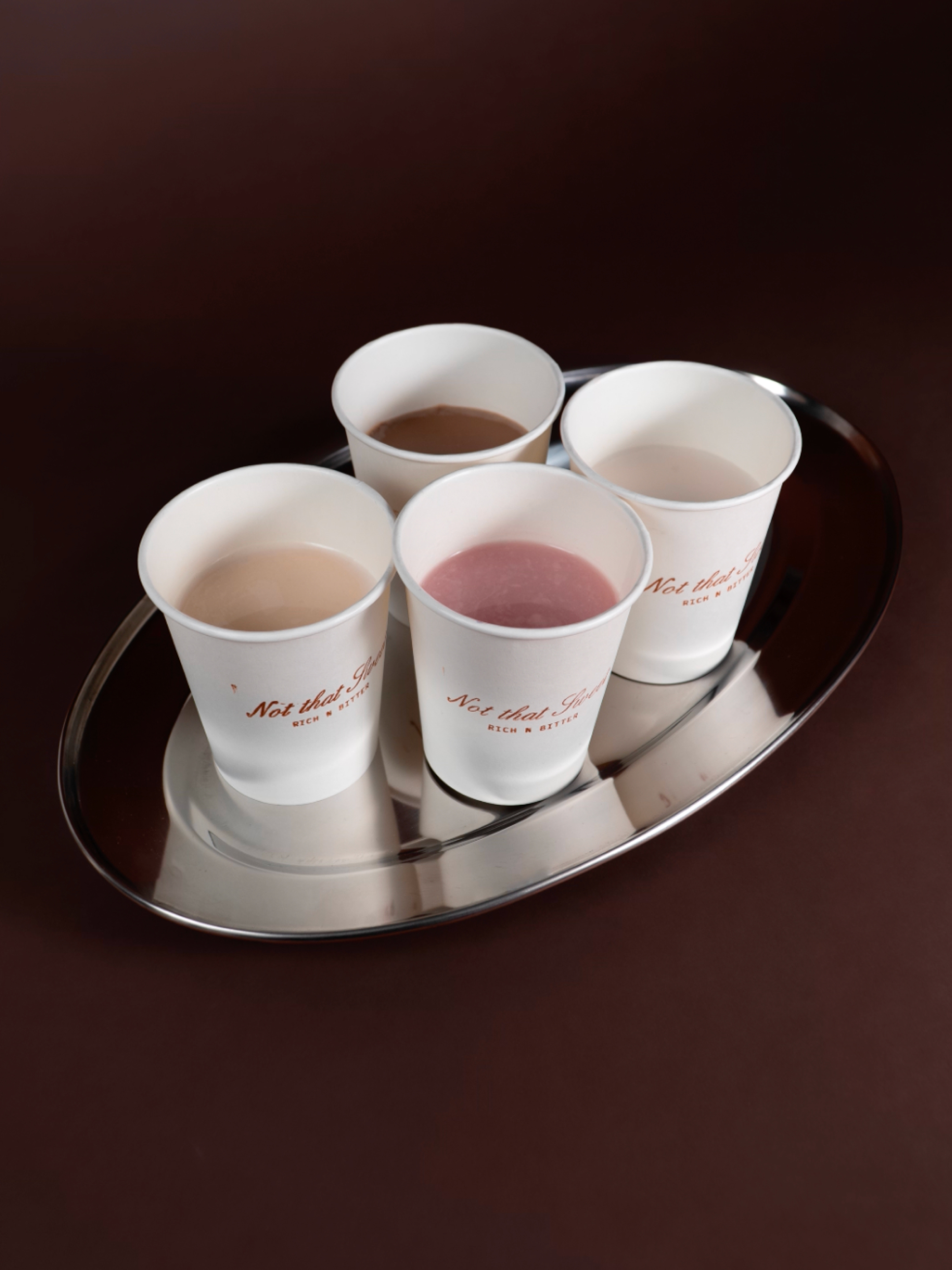
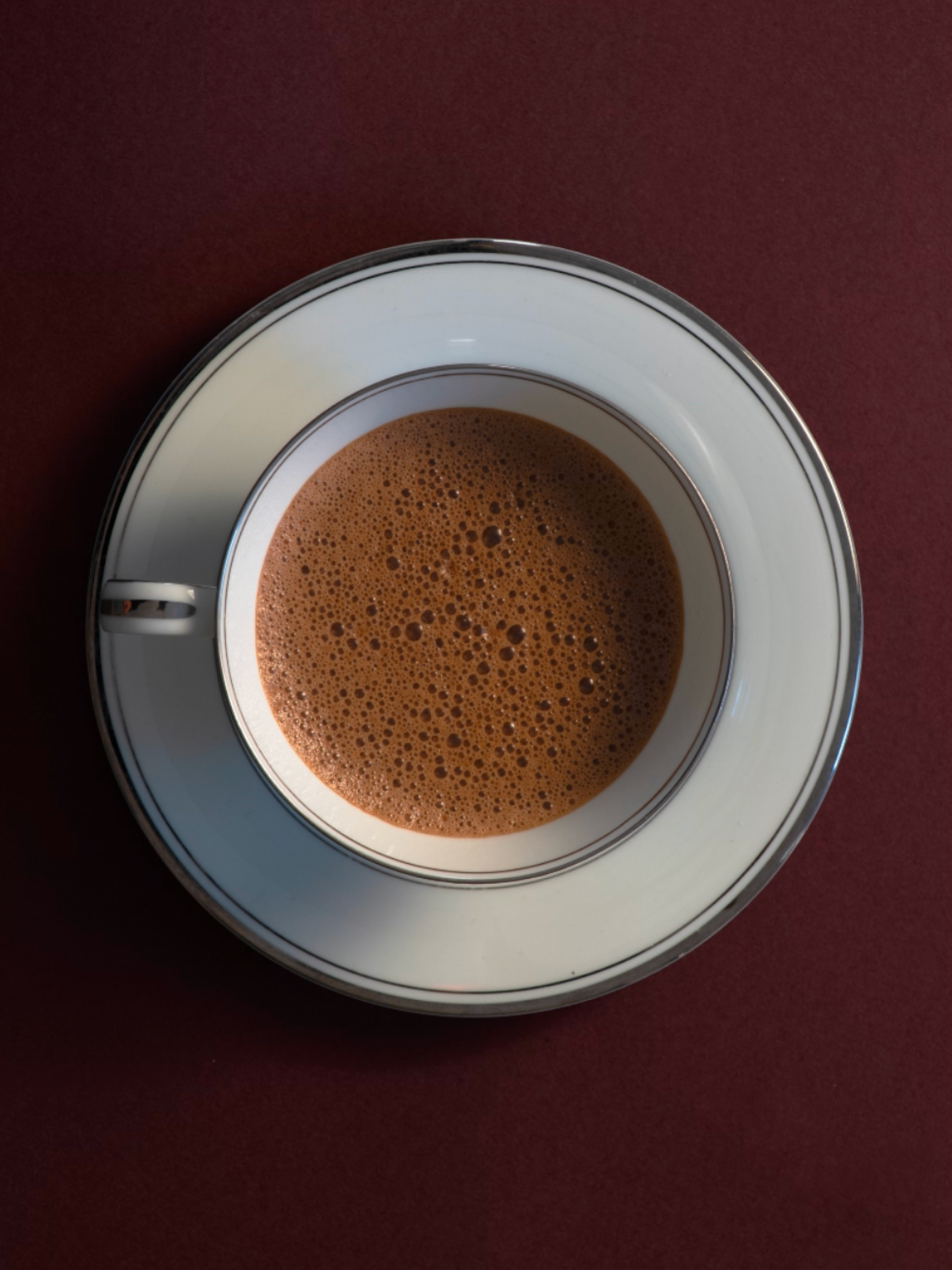
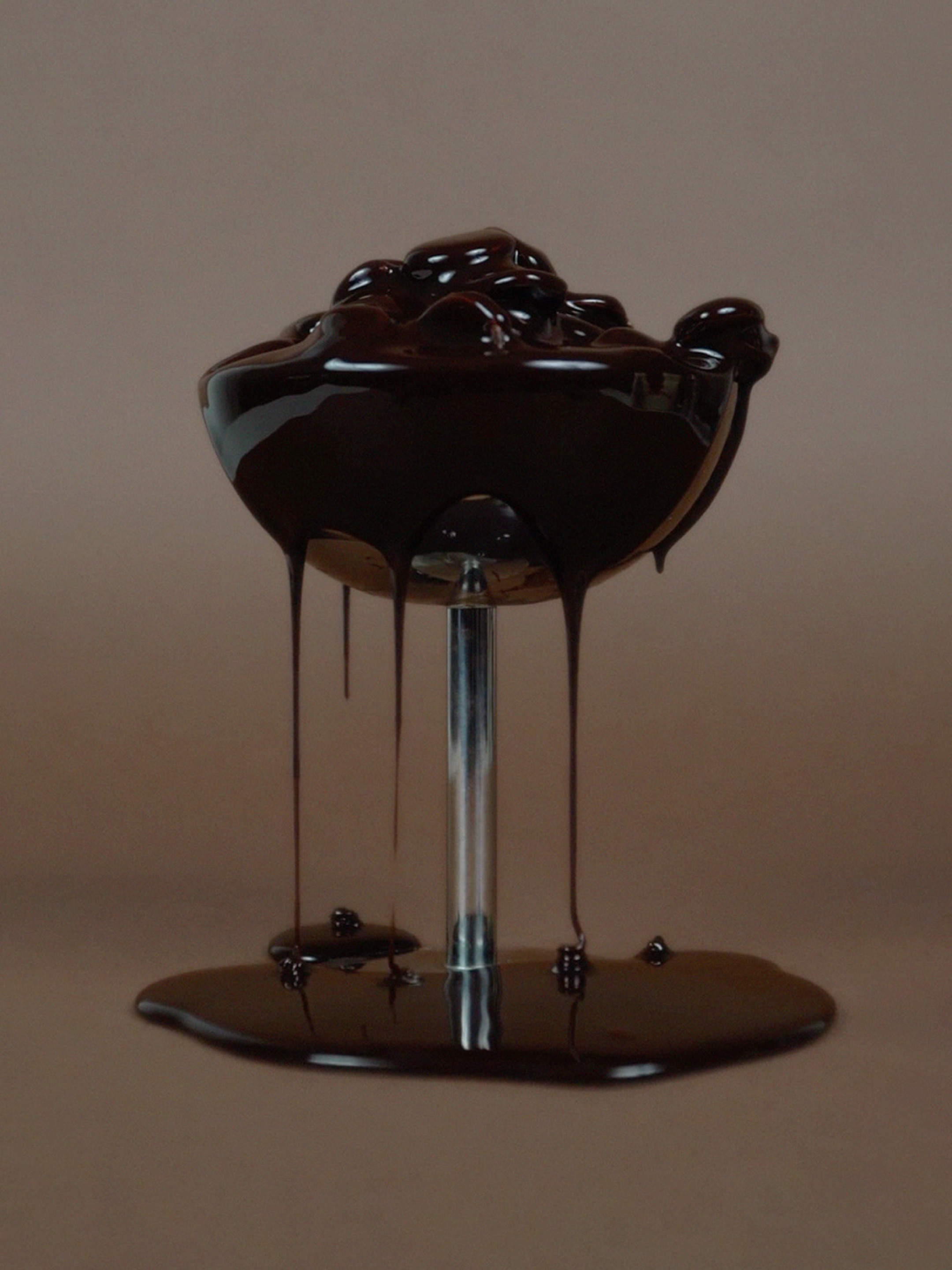
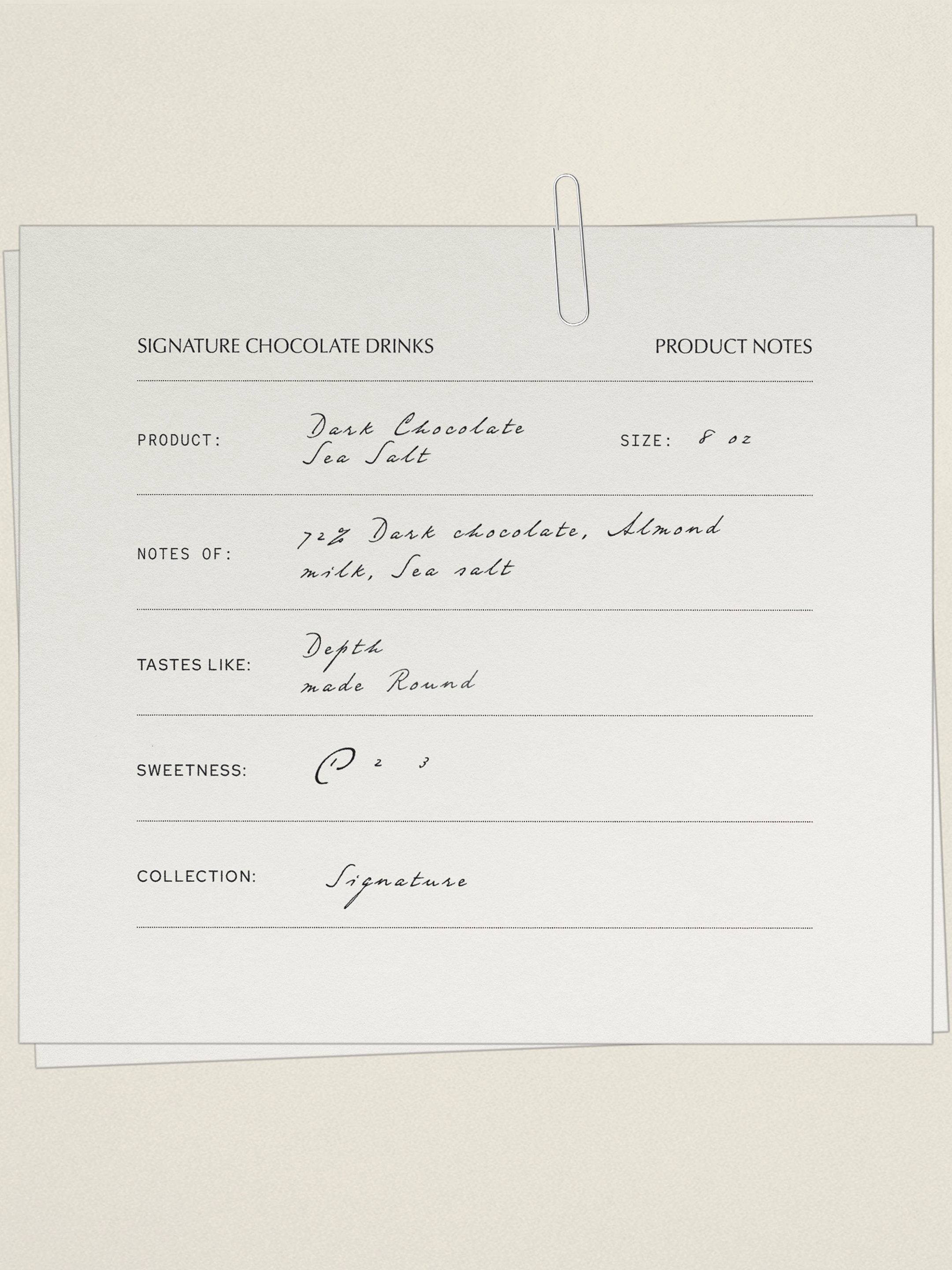
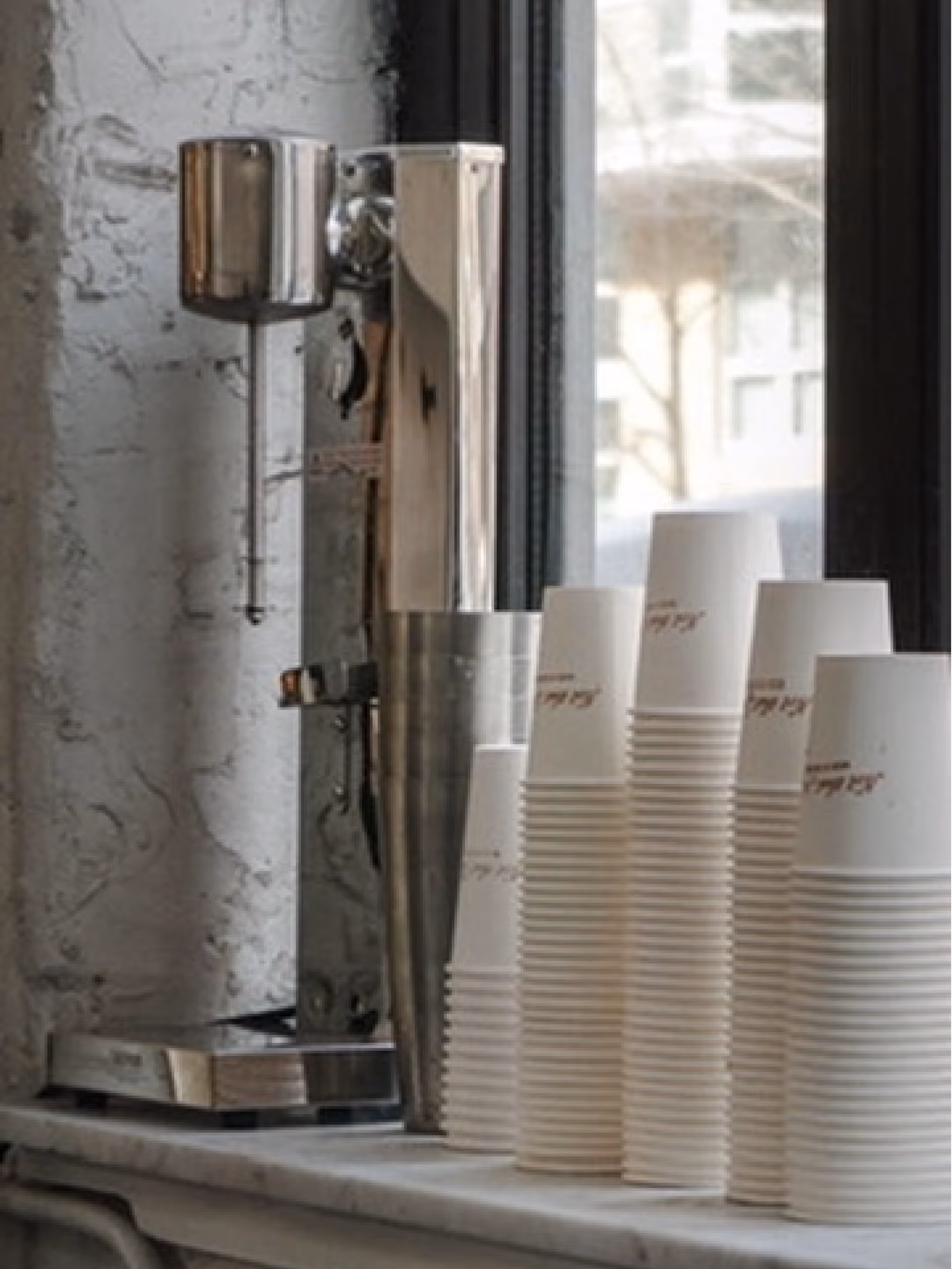
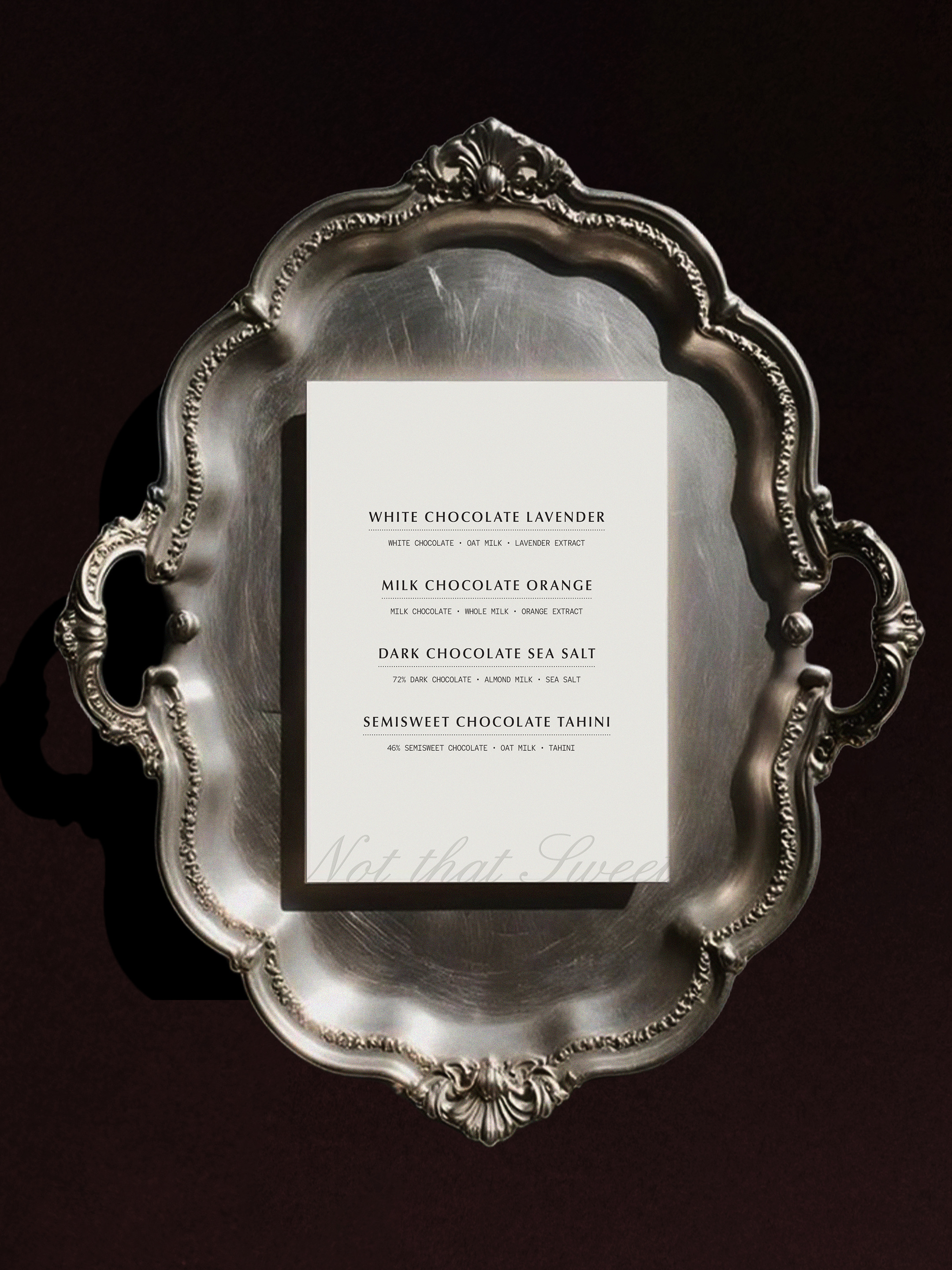
Not That Sweet
Creative Direction • Brand Identity
Not That Sweet needed a brand experience that felt as distinctive as the café itself. I developed the visual identity, (in the process of designing and buildnig the website), directed and shot photography, and created an adaptable marketing system spanning packaging, menus, social media, and seasonal campaigns. The focus was on creating a cohesive brand that could evolve alongside the business while giving the owner practical tools to maintain consistency across every customer interaction.
See More →


